Friday, 20 May 2011
Monday, 16 May 2011
Focus Grou Questionnaire And Feedback
Questionnaire

First graph: 1. What Gender Are You?
Basically shows the result of the number of people that took part of the questionnaire in our focus group. The Graph shows that 12 males took part and 8 females. I believe that it was important that more males then females took part as horror films are primarily targeted towards a male audience therefore i believe it is important that we get feedback from our potential audience.

Second Graph: 2. Your Age?
The graph shows the results to the second question which is what is the age range of those in the focus group? Majority of people who took part in the focus group where 20 years old towards 29 years old. The age groups 17, 18 and 19 years came next. These results are important to our group because our film trailer will be targeted to theses age ranges, therefore it is important that we have feedback from people within this age range.

Third Graph: 3. What is Your Occupation
The Graph shows the current occupation of those who in our focus group. The graph shows that 13 people of the focus group are in education while 6 are employed and one in other. The results are pretty much an ideal set of feedback for our trailer as these are the people we would be targeting the film too.

Fourth Graph: 4. What Is Your Favourite Genre of Film?
The forth question allows us to see the preference of genre in terms of films for those who took part in the focus group questionnaire. The graph shows that Horror and Romance where the most popular Genres in our focus group while action and comedy where the least voted in the graph, thriller genre was pretty much in between the two most popular and the two least popular.

Fifth Graph: 5. How Often Do You Watch Film Trailers?
The 5th question shows how often participants of our focus group watch. The graph shows that that majority of the focus group participants will at least watch a film trailer once a week or even ever fortnight
Sixth Graph: 6. what is Your Favourite Film?
Favourite Films From Our Focus Group (Not in Order) |
1. Lord of the rings trilogy |
2. Inception |
3. Iron man series |
4. Old boy |
5. Ninja assassin |
6. The other guys |
7. Donnie Darko |
8. Jackass series |
9. Due Date |
10. Get Him To The Greek |
11. The Mist |
12. Zombie Land |
13. 28 days later and the sequel |
14. Hancock |
15. G.I Joe |
16. Afro Samurai |
17. Bad Boys |
18. Scream |
19. Halloween series |
20. Shogun Assassins |
Seventh Graph: 7. Would You Go and See the Film in the Cinema and/or But It on DVD?
Graph 7.1

Graph 7.2

5 Stars Rating Of Our Trailer

The Graph Basically shows the results of the ratings of our trailer from the focus groups perspective. As you can see in the graph its mixed views on the quality rating of our trailer. The graph shows that 6 people believe it was a full 5 star quality, 11 people choose that it was a star rating of 4 stars, and 3 people thought the film of a 2 star quality.


Thursday, 12 May 2011
Camera Shots, Angles and Movements Part 1: Camera Shots
Examples Of Potential Camera Shots, Angles and Movements We May Use:


OSS (Over-The-Shoulder Shot)
Looking from behind a person at the subject
CU (Close Up)
A certain feature or part of the subject takes up the whole frame
Cut In
Shows some (other) part of the subject in detail.
ECU (Extreme Close Up)
The ECU gets right in and shows extreme detail.
EWS (Extreme Wide Shot)
The view is so far from the subject that he isn't even visible. Often used as an establishing shot.
MCU (Medium Close Up)
Half way between a MS and a CU.
MS (Mid Shot)
Shows some part of the subject in more detail while still giving an impression of the whole subject.
Point-of-View Shot (POV)
Shows a view from the subject's perspective.
VWS (Very Wide Shot)
The subject is visible (barely), but the emphasis is still on placing him in his environment.
Weather Shot
The subject is the weather. Can be used for other purposes, e.g. background for graphics.
WS (Wide Shot)
The subject takes up the full frame, or at least as much as comfortably possible.
Storyboard
A film story board is basically a comic of the film and parts of it which is constructed before filming of the movie. Storyboard helps directors and cinematographers in seeing future factors that could be a potential problem
Below is a image of the Storyboard for The After Hour Trailer:

Camera shot list:
Row 1 Column 1: CGI
Row 1 Column 2: Mid Shot (MS), Medium Close Up (MCU)
Row 2 Column 1: Very Wide Shot (VWS), Group Shot (GS)
Row 2 Column 2:CGI
Row 3 Column 1: Point-of-View Shot (POV), Two Shot, Close Up (CU)
Row 3 Column 2:CGI
Row 1 Column 2: Mid Shot (MS), Medium Close Up (MCU)
Row 2 Column 1: Very Wide Shot (VWS), Group Shot (GS)
Row 2 Column 2:CGI
Row 3 Column 1: Point-of-View Shot (POV), Two Shot, Close Up (CU)
Row 3 Column 2:CGI
Types of Camera Movements we will consider:
· ARC
· Crab
· Follow
· Pedestal
· Pan
· Tilt
· Tracking
· Trucking
· Zooming
Below is theOrginal Story Board for Our first Fil Trailer Idea

Music:
Music is a very important part to film trailers as it sets the overall atmosphere, the genre of music can also help establish the genre of the film. Below you will find the songs we considered to put in our trailer:
Below you will find te music we have thought about putting in our Film Trailer:
Evanescence - Bring Me To Life
Evanescence - Going Under
System Of A Down - Chop Suey!
Korn - Freak On A Leash
DMX - What's My Name
Slipknot - Psychosocial
Slipknot - Duality
Slipknot - Before I Forget
Slipknot - Dead Memories
Nirvana - Smells Like Teen Spirit
Locations:
Potential Locations for our Trailer
1. Group Member Blake’s back yard
2. Royston Field (near Penge Sainsbury)
3. Kelsey Park Sports College/Kelsey’s Woods
The locations of horror film are a very important part of it. The locations we have short lasted have elements that we want to utilize for the trailer. Blake’s back yard, Royston Field and Kelsey Woods have a slight fell of absence as the scales of the locations are rather large. Therefore for our trailer we were looking to enhance the feel of absences by using edits, lighting, mise en scène, camera shots, and sounds such aspects like fast edits will help raise the tension, alongside lighting and camera shots can also help in building a tense and heart dropping atmosphere.
Image of the First Possible Location:

Image of the Second Possible Location:

Image of the Third Possible Location:

Props and Costume:
Prop and Costume List:
· Three Props Knifes
· Three Black Hooded jackets (for the villains)
· Three Black jeans
· Three pairs of black boots or trainers
· Fake Blood
Why were theses Props and Costume needed?
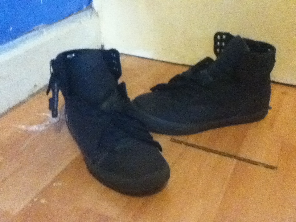
Theses props are important part of the mise en scene of our trailer. We used props that intertwine with the genre of horror of our film trailer. Knifes are most definitely a significant factor to horror films especially those of the slasher and supernatural sub-genre of horror. Some of the most popular horror films such as ‘Halloween’, ‘Jason’ and ‘Scream’ revolve around bladed weapons such as knifes machetes and axes. Therefore we felt for our film it was important to ad the elements of bladed weapons. We also dressed the villains in all black urban wear. The villains costume resembles the costumes of Screams antagonist which is also a film which revolves of the slashing of innocent victims. Therefore carry on the continuity of the horror genres mise en scene. We also placed fake blood alongside the blades of the prop knife. The fake blood gives the suggestion that the antagonist’s have used the knifes to injure or even kill.
Images of The Actual Props Used For Our Trailer:
Prop Knifes Used In The Trailer

One Of The Hooded Jackets Used In The Trailer

One Pair of Black Jeans Used In The Trailer

One Pair of Black Trainers Used In The Trailer
Monday, 9 May 2011
Tuesday, 8 March 2011
Outline For Magazine Covers
BluePrint 1

BluePrint 2

BluePrint 3

BluePrint 4

BluePrint 5

BluePrint 6

BluePrint 7

Outline for The Media Poster

1. This section of the Poster is going to consist of a close up of the main character covering half of the cover with half of his face in the shoot
2. This section of the poster is going to show the three villains of the story walking forward in a medium shoot
3. Title
4. Institutions
Tuesday, 1 March 2011
The Orginal Steps Of Our Film Trailer
1. Drinking – Passes Out The Night Before (Flashback footage)
2. Waking up in the mourning (Protagonist has a slight Hangover)
3. Rushing to get to school
4. Runs to school
5. Walks into classroom – (Protagonist: Is Sorry that there late)
6. Friend asks why the protagonist is late (Flashback occurs[Footage of First Step])
7. Protagonist Falls asleep
8. Protagonist wakes up /Classroom is empty
9. Protagonist goes around the school, notices villains/killers are blocks his path
10. Protagonist hides (behind doors and staircase)
11. Villains/killers notices the protagonist by a sound he accidentally makes
12. Protagonist tries to escape
Film/Trailer Schedule
19th February Saturday - Filming Trailer
What Took Place On The Day:
- Waking Up Late
- Rushing to get to school
- Browsing the net
- Falls asleep
21st February Monday - Filming Trailer
What Took Place On The Day:
- Victim tries to find people, but notices errie stuff to start to happen
- Hiding behind doors and stairs
- Shoots of the killers and there weapons
- Shoot of killer chasing the protagonist
- Shoot of killers together looking for the protagonist (which is hiding behind the wall)
- He tires to run away
- Victim stumbling down stair
23rd February Wednesday - Draft –Editing
What Took Place On The Day:
- Came up with ideas for the final editing
25th Friday Poster – Planning
What Took Place On The Day:
- Looked at research of posters and there conventions
- Blue print on potential posters
Saw Poster

Main Character: Victim in a killing trap (Amanda Young in the reverse Bear trap)
Tagline: “HOW MUCH BLOOD WOULD YOU SHED TO STAY ALIVE?”
“EVERY PUZZLE HAS ITS PIECE”
Colours: Black, Red and Grey
Tagline: “HOW MUCH BLOOD WOULD YOU SHED TO STAY ALIVE?”
“EVERY PUZZLE HAS ITS PIECE”
Colours: Black, Red and Grey
The first Saw poster uses very basic functions to conjure a terrifying fate for the victim in the reverses bear trap. The image shows a victim with a reverse bear trap attached to her face. This shows to the viewer that this film is heavily influence by traps and torture as the victim in the trap would be in fear for her life as you can see in her eyes in the poster. Showing a person with a weapon on there face that could potential kill the person by ripping the face apart would defiantly attract an audience to see if she will make it alive. The audience that this is most likely to be aimed at is a young to middle age audience (18-35 years old), most likely a western Caucasian audience as well. You can tell by the only person on the poster is young Caucasian women who would most likely look attractive if she did not have a bear trap clenched to her face, by infusing beauty and butchery it will result in gaining a heterosexual male audience. Seeing a victim on a horror poster alive with the potential weapon that could kill them is not often seen on horror posters, this is why I think the poster is effective as it uses minimal conventions and factors but conveys a strong image which you’re likely not to forget.
The Saw poster has two taglines to it, although film posters often just have one this makes the poster more attractive. The first tagline for the poster is “HOW MUCH BLOOD WOULD YOU SHED TO STAY ALIVE?” and the second tagline is “EVERY PUZZLE HAS ITS PIECE”. The first tagline shows that the film maybe heavily induced with carnage, as it asks an actual life and death question. The questions could be taken from a quote from the film therefore showing that someone in the film will be put into the situation, but the question can also be seen as being asked towards the audience looking at the poster. This in result can immerse and submerge a relationship between the audience and the film or a character in the film as they would imagine what they may do in a situation similar to the character in the film. The second tagline “EVERY PUZZLE HAS ITS PIECE” shows that the film is also a thriller or at least takes thriller conventions from the genre, as the plot is loosely referred to as a game (Puzzles), which thrillers are often seen as. This could also show that the film uses thrillers factors to help make a successfully film such as suspense, tension and excitement.
The use of colours helps reinforce the posters main intention to demonstrate the twisted horror which the film is about. The colour black is used to dominate the poster. Black is associated with power, death, evil and mystery. The colour black is a mysterious colour which is often affiliated with fear and also the unknown (for example a black hole). Black also connected to negative connotations such as black listed, black humour or Black Death. Black also denotes strength and authority. As it is regarded to be formal and prestigious (Black tie, black dress and black limo all annotate formality). For this poster I believe that the colour black was used more for the uses of the association towards mystery, power and death rather then formality. Second colour which is used for this poster is the colour white; this is mainly to give a bit of balance to the poster. White is associated with light, goodness, innocence and purity. This colour is often considered to be a colour to represent perfection. This colour is mainly used for the text (excluding the title ‘SAW’). With the large amount of black used for the poster, assigning white for the colour of text makes it clear and readable to read, and also attractive as it grabs the intentions of the viewer/passer by. Greys are used for the colour of the victim. Greys a mix between black and white, one which represents negativity the other represents positivity giving grey the 50/50 balance in between. This shows that the victim may be innocent in the film or guilty (as black is seen as in-pure and white is seen as pure), all depending on the villains view. The colour red is used for the title to grab attention of the audience as it is the most vibrant colour out of the three colours. Red is the colour often affiliated to both fire and blood, so it is often seen as a colour that represents war, danger, strength, love, desire and power and also courage as it used in many flags around the world. Red is seen as a very emotional colour and is a very visible colour as it is used for stop signs; stoplights and fire emergency equipment are painted red as they grab the attention of others around the colour. Red text brings it forward to the foreground. With the title coloured in red denotes that the film is heavily involves danger and there maybe a lot of bloodshed in the film with the tagline at top asking “HOW MUCH BLOOD WOULD YOU SHED TO STAY ALIVE?” it connects to the titles main colour which is one shade of strong red. Using theses three colours of black, white and red is often seen in the horror genre and is a popular convention for it. Although this poster uses theses colours very simply with only on shade of black, white and red to convey the image, although the character in the poster is in different shades of grey to show realistic detail of the character although taking colour away from her face makes her almost lifeless.
· The poster evokes tension, suspension and potential death
Besides saw 6s poster the other posters in between pretty much use the exact same conventions. Saw 2,3,4 and 5 use mainly Black, white and red. The main difference is how the use these colours both differently and the same .
Wednesday, 9 February 2011
The Amityville Horror (2005)

Background Info
Synopsis:
In 1973 in a small community of Amityville on Long Island, New York, the entire DeFeo family was murdered in their beds, after they had only lived in the house for 28 days. The oldest son, Ronald DeFeo Jr. confesses to police that he heard voices from the house, and he was ordered to kill all 6 family members. A year later, the house is sold to George (Ryan Reynolds) and Kathy Lutz (Melissa George) for a cheap price. They ask why so cheap, and they were told that the DeFeo family was murdered in the house. George tells his wife that houses don't kill, people do. So they move in with their three children and start a new life. Unfortunately, their dream house becomes a nightmare. George begins to hear voices and the process starts all over again. The longer they are in the house, the worse it gets, and everything comes to a climax on the 28th day.
In 1973 in a small community of Amityville on Long Island, New York, the entire DeFeo family was murdered in their beds, after they had only lived in the house for 28 days. The oldest son, Ronald DeFeo Jr. confesses to police that he heard voices from the house, and he was ordered to kill all 6 family members. A year later, the house is sold to George (Ryan Reynolds) and Kathy Lutz (Melissa George) for a cheap price. They ask why so cheap, and they were told that the DeFeo family was murdered in the house. George tells his wife that houses don't kill, people do. So they move in with their three children and start a new life. Unfortunately, their dream house becomes a nightmare. George begins to hear voices and the process starts all over again. The longer they are in the house, the worse it gets, and everything comes to a climax on the 28th day.

Box Office/Business:
Budget:
$19,000,000
$19,000,000
Opening Weekend:
$23,507,007 (USA)
£1,339,417 (UK)
$23,507,007 (USA)
£1,339,417 (UK)
Gross:
$65,233,369
$65,233,369
Studio: Platinum Dunes (Production Company which have produced Horror films such The Texas Chainsaw Massacre, The Texas Chainsaw Massacre: The Beginning, The Unborn, Friday the 13th, Horsemen, and A Nightmare on Elm Street)
Distributed By: Metro-Goldwyn-Mayer and Dimensions Films
The Horor Poster

1) Title: The Amityville Horror
Based on a true story
Based on a true story
‘Amityville’ is a real location in America and ‘horror’ pretty much explains the type of plot and genre. The name suggests that a horrific event will take place in Amityville, although you would have to watch the whole film to find out what will take place.
2) Graphic combined with the title: the ‘Y’ in the title is dripping downwards in a thin, red, long streak resembling a blood drip. This symbolizes that there would be bloodshed and death.
3) Tagline: Katch’ em and kill’ em
The tagline puts outside audiences view to the perspective of the villain in the film. As the villain has likely to be watching the victims in the house for a long period of time and then getting prepared to kill them
4) Images:
1.large old fashioned house in the background
2.Two possible walls (Possible Walls of the large old fashioned house)
3.And A Man wearing T-shirt and jeans holding a shotgun
1.large old fashioned house in the background
2.Two possible walls (Possible Walls of the large old fashioned house)
3.And A Man wearing T-shirt and jeans holding a shotgun
The image conjure together could mirror important factors to the film. As the large old house could symbolize the main location of the film and where the sadistic events will take place. The wall on the side of the house and image almost resembles black curtains which can symbolize that the killings will be closed of to those out side of the house which also makes it the perfect place to kill. The man in the picture could be the killer or a victim trying to survivor therefore creating attention to the audience who want to find out who he is and what his fate maybe.
5) At the very top of the poster it says “FROM MICHEAL BAY, THE PRODUCER OF TEXAS CHAN SAW MASSCARE” and under the title it also says “BASED ON A TRUE STORY”. The first thing you read on the poster is who it is produced by, therefore those who already like the Texas chainsaw massacre. Also saying that it is based on a true story would make more people egger to watch the film, even those who may not be fan of the genre. This also builds a very unique selling
5) At the very top of the poster it says “FROM MICHEAL BAY, THE PRODUCER OF TEXAS CHAN SAW MASSCARE” and under the title it also says “BASED ON A TRUE STORY”. The first thing you read on the poster is who it is produced by, therefore those who already like the Texas chainsaw massacre. Also saying that it is based on a true story would make more people egger to watch the film, even those who may not be fan of the genre. This also builds a very unique selling
Colours:
· Grey House
· Black Walls (surrounding the house and character)
· Character in front of the door has a florescent light shining around him.
· Red title
The four main colours help connote and denote to the audience the nature of the film. The grey house with an olive finish evokes strong emotions. The colour grey is a cold colour which in nature is often seen in stormy clouds and metal, both cold objects and elements. The colour grey is also a colour of mourning; so on a whole the grey in this poster is used for symbolizing death with the cold feeling and mourning of life. The colour used for the black walls surrounds the poster in darkeness. Using black for the walls shows the mysterious blackness consuming the poster. Black is helps provide a darkness theme to the poster alongside the cold death feel to it. The main character has a light shinning around him; the source of the light could be from the main character or the house. The light around the character can help show he is the key character in the film, although if the light is from the house it could show that the light is welcoming the main character, away from the blackness around the house which is actually the houses walls , therefore it is actually a trap for the main character. The title is in red which is a very powerful colour that symbolizes many different things. In this poster the red symbolizes blood, due to it being a horror genre this convention is often used it shows that there may be blood spill in the film. The colour red also is associated with war, danger, strength and power and also passion, desire and love, it is a emotionally intense colour, therefore very wise and powerful to use on the poster.
The Horror Trailer
 |
Using Black and white with a colour film gives the impression that there is history behind the plot and that it has been achieved |
Quick edits are used with close ups of cut outs from newspaper articles help allow the audience to know that a lot has taken place and it was considerable wide spread news as the amount of headline cut outs are shown , also shows the victims pictures and a picture of the suspect and other factors from the news report that may be important to the story line such as a picture of a teddy bear
 |
Vast about of information can be communicated to the audience via newspaper cut outs |
Also the quick edits helps show that there is violence and death in the films with the quick black and white flashes from the news report of a shot gun and a body bag being wheeled out from the house. While the uses of edits combining the achieved black and white footage, “Based on a true story” and the date of “November 13, 1974, Long Island, New York, 412 Ocean Avenue” appears on the screen with a typewriter font and a black background with slow transactions to the next shot allowing the audience to be fully aware that the films is based on a true story which may of happened in November the 13th 1974 in long island new York, 412 Ocean Avenue
The shots and mood moves on to a year later from what happened by showing “One Year Later, The Lutz Family move into 412 Ocean Avenue” with the same font as before as a typewriter font with a black background, which allows the audience to know that the new family may have the same destine fate as the family which lived and died there the year before. Just before this is shown there rather fast flashes of occult symbols and a reporter saying that the killer was told by voices to kill his family. Once the inter title establish that there’s a new family we are presented with a home video of the Lutz Family moving into their new home with a father with his son, and mother, in the background you can hear a child laughing and the sound of the role of reel spinning helps establish that it is a old recording but also the child laughing allows the audience to sympathizes with the innocence family as we know there is a bad history with this house and that s child was murder there and also the laughter sets an eerie tone. With the home video shots there is a certain end shot which shows the top of the house then a quick flash turn the shot almost negative with a black and gray finish with lighting in the background and then moving onto a black background with the inter title of “They only lasted 28 days”. This is pretty much the last part of the trailer both non-diegetic sounds are used such as the violin stings in the background and the lighting and thunder that is establish with the shot of the home from the outside before moving into the inside, the bad weather helps set the mood of the story lines atmosphere, this is also the exact opposites of the weather in the home video. The use of alarming and frightening images help establish the disruption in the family due to the home such as extra pair of arms appearing out of the bath tub, pale blue/grey eyes and the face f a ghost/sprit. The trailer then ends with the silhouette shoot of the house with two window panes light with a reddish light resembling red eyes.
The Amityville horror trailer starts of at the begging with a blank screen with a diegetic gunshot sounds, therefore building a tense atmosphere for the audience as gunshot rarely symbolizes anything positive and only negative features, such as fear, carnage and death. Although this first part of the trailer is rather lifeless symbolizes that death is an important factor to the story line. The trailer is brought to life by the sound of a old television switching on and the first visual of the film of a fast distortion of a black show on the screen. This gives the impression that the scene is factual as it’s presented as a news broadcast with a police officer’s being asked a question by the on scene news reporter, and the Police officer replying “I’ve never seen anything like this” showing that something terrible, horrific has taken place. The use of black and white colour helps establish the time period of when the news report took place.
Subscribe to:
Comments (Atom)